Table of Contents
Public-facing digital signs serve people of different ages, languages, and abilities. Accessibility here is mostly clear contrast, calm motion, and plain wording—not a separate “special mode” you never enable.
Why accessibility is operational, not optional
If a visitor cannot read your hours or safety note, the sign failed its job. Accessible design also helps everyone in bright lobbies and noisy events.
Contrast, size, and motion
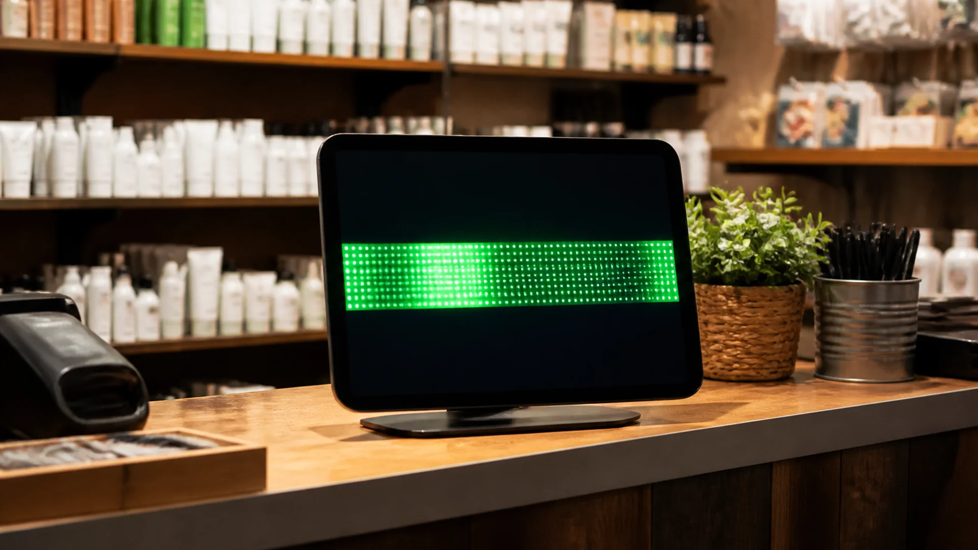
Prefer large type, strong contrast, and avoid rapid flashing. Offer a slower scroll option for lobby loops; flashing promos can trigger discomfort and look unprofessional.
Plain language beats cleverness
Write grade-school clear sentences. Spell out uncommon abbreviations. Put the action first (“Exit left for tickets”) rather than burying it in marketing fluff.
Placement and alternative formats
Mount within typical sightlines; do not hide critical info behind glare or decorative plants. For essential notices, pair the ticker with a static printed or posted version.
A short accessibility checklist
Test with someone who was not involved in writing the copy. Confirm color contrast, reduce motion where possible, and keep emergency messages free of jokes or effects.
- High contrast text and background
- Font size readable at the planned distance
- No rapid strobing or seizure-risk flashes
- Plain language; one idea per line when possible
- Critical info available in a non-scrolling form too
Try it
Soft next step: open the free LED text generator on LED Scroller and test your message on a phone or TV—no account required.
About the author: LED Scroller Editorial publishes industry Insights for event teams, shops, and creators. We separate product how-tos (blog) from timely industry notes (news).