Table of Contents
Fancy fonts and rainbow effects rarely save a message that scrolls too fast or sits on a low-contrast background. For public signage, readability is the product.
People glance; they rarely study
Most viewers are walking, waiting, or multitasking. Design for a one- to three-second glance window, then confirm the full loop is still comfortable for seated audiences.
Scroll speed as a readability control
If viewers need to re-read the line twice before understanding it, slow the crawl. Indoor lobbies usually need slower motion than a concert lower-third vibe.
Contrast beats neon clutter
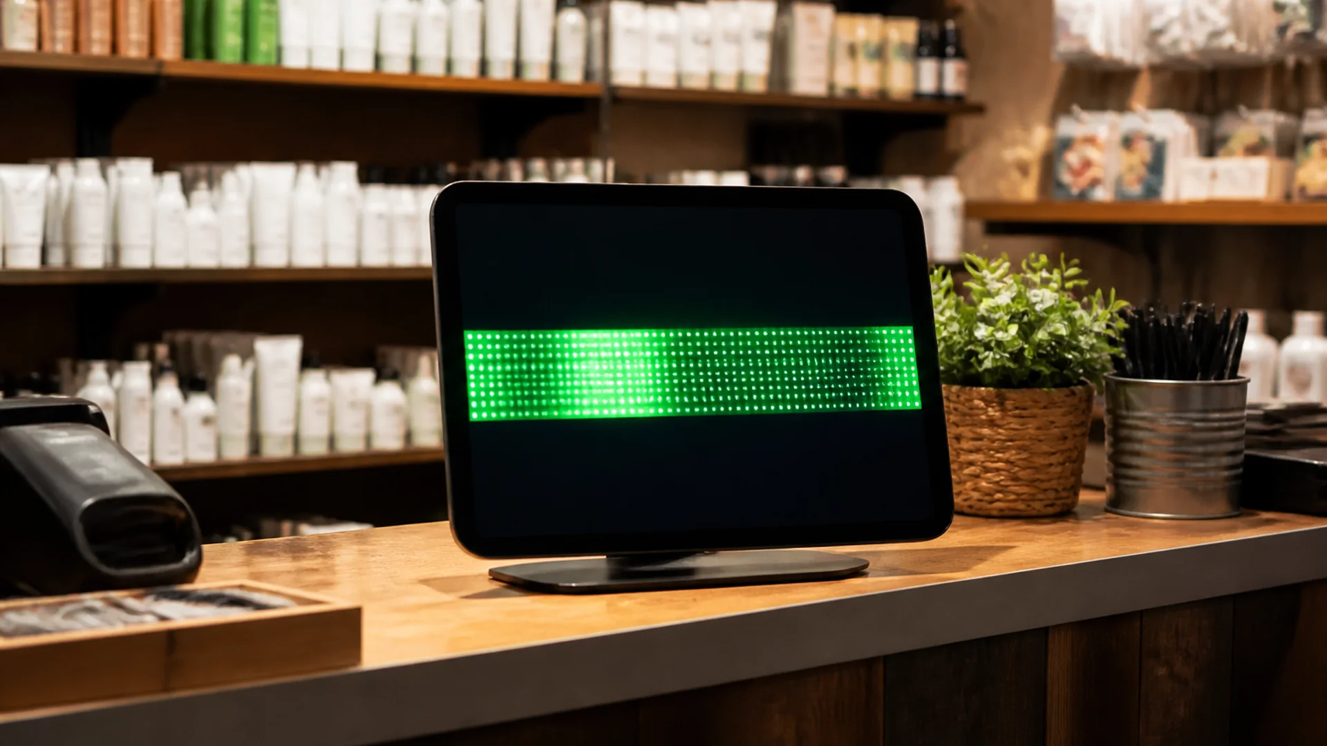
Light text on near-black backgrounds remains the safest default for LED-style UIs. Neon on neon looks energetic and fails outdoors or under wash lighting.
Message length and repetition
Split long announcements into two shorter loops. Priority info first; decorative flair last—or omit it.
A two-minute field test
Stand at the real viewing distance, hold a phone camera briefly, and check whether a colleague can recite the offer after one pass. If not, slow down or shorten.
Try it
Soft next step: open the free scrolling text maker on LED Scroller and test your message on a phone or TV—no account required.
About the author: LED Scroller Editorial publishes industry Insights for event teams, shops, and creators. We separate product how-tos (blog) from timely industry notes (news).